
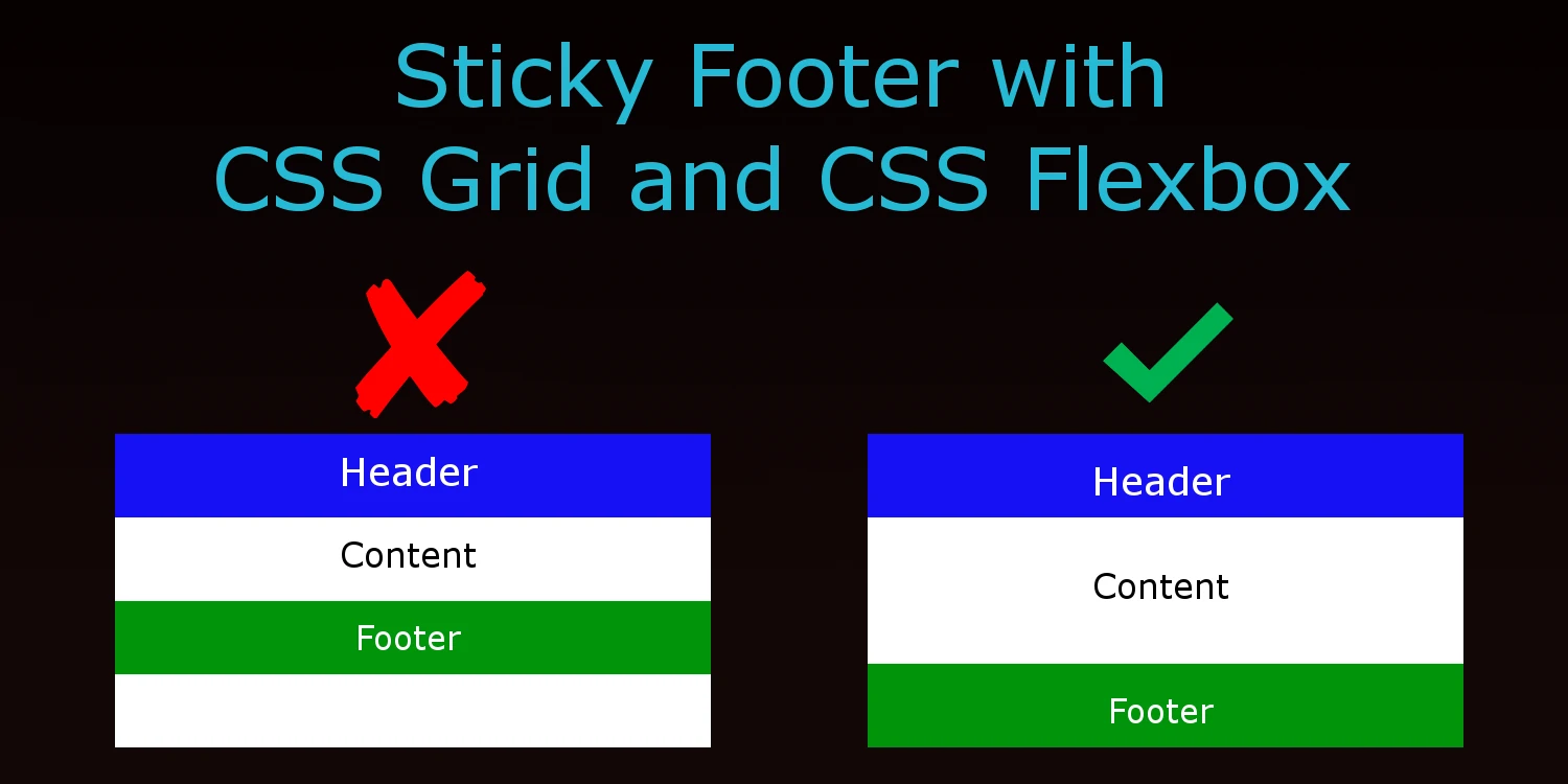

You’re excited to start your new website and start laying down a skeleton layout that includes a header and a footer. You add some sample pages only to discover that your footer section won’t stay at the bottom on pages with minimal content. This scenario happens all too often and used to require quirky fixes until the more recent flexbox and CSS grid features.
With the addition of grid and flexbox as a display model, we now have very easy and elegant ways to solve this problem without having to use floats or positioning.
We’ll use the following skeleton HTML code for this exercise.
<html>
<body>
   <div class="container">
       <header></header>
       <main></main>
       <footer></footer>
   </div>
</body>
</html>
CSS Grid
Setting the container element as grid will allow us to have flexible sizing rows. Think of your page as having three main rows: header, main and footer. Using the display model of grid, you can control the size of each row using the grid-template-rows properties. Setting the 1st and 3rd row to the value of auto means they will be as high as the content they contain. Setting the 2nd row to 1fr (a fractional unit), means it will fill up 1 unit of the remaining space which happens to be the remaining height of the display since there are no other fr values being set on other rows.
html, body {
 width: 100%;
 height: 100%;
}
.container {
 display: grid;
 grid-template-rows: auto 1fr auto;
 grid-template-columns: 100%;
 min-height: 100%;
}
CSS Flexbox
Setting the container section to display as flex allows us to have the flexible sizing of its content as well. By default, the flexible sizing will occur with the horizontal space but by setting flex-direction value to be column, we have flexible sizing of the vertical space.
The “flex” property of the main class is shorthand to set the value for the flex-grow, flex-shrink, and flex-basis CSS properties. These properties tell the browser what rate it should grow/shrink to fill the space it is in. By default it is set to 0. Thus, setting the main section to flex at 1 will fill ALL the remaining space.
html, body {
 width: 100%;
 height: 100%;
}
.container {
 display: flex;
 flex-direction: column;
 min-height: 100%;
}
main {
 flex: 1;
}